This project tasked me with redesigning a portion of a government accountability office report, with the primary goal of condensing information better, creating infographics to go with data within the report, and preserving, and enhancing hierarchy and legibility.
Keeping with a simple style, I opted for a 5 column layout to allow for a little more room to work than the 3 columns of the original layout. Per project requirements, I selected a simple color scheme that contributed to the subject of the chosen report.
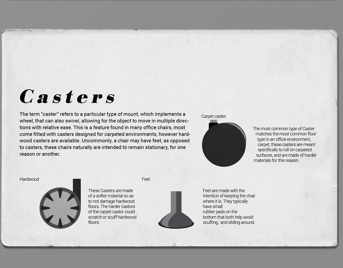
This project also proved a great opportunity to explore data visualization. I created info graphics throughout to compliment information found throughout the report, exploring how presenting information in this manner can ultimately make it more impactful for a viewer.


